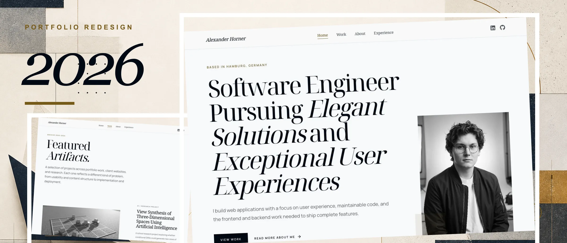
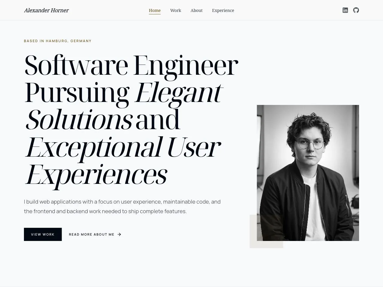
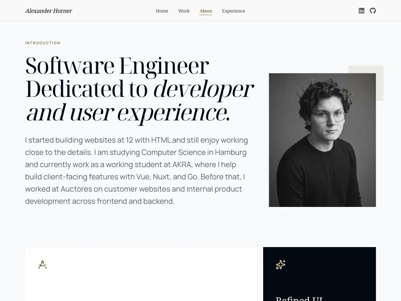
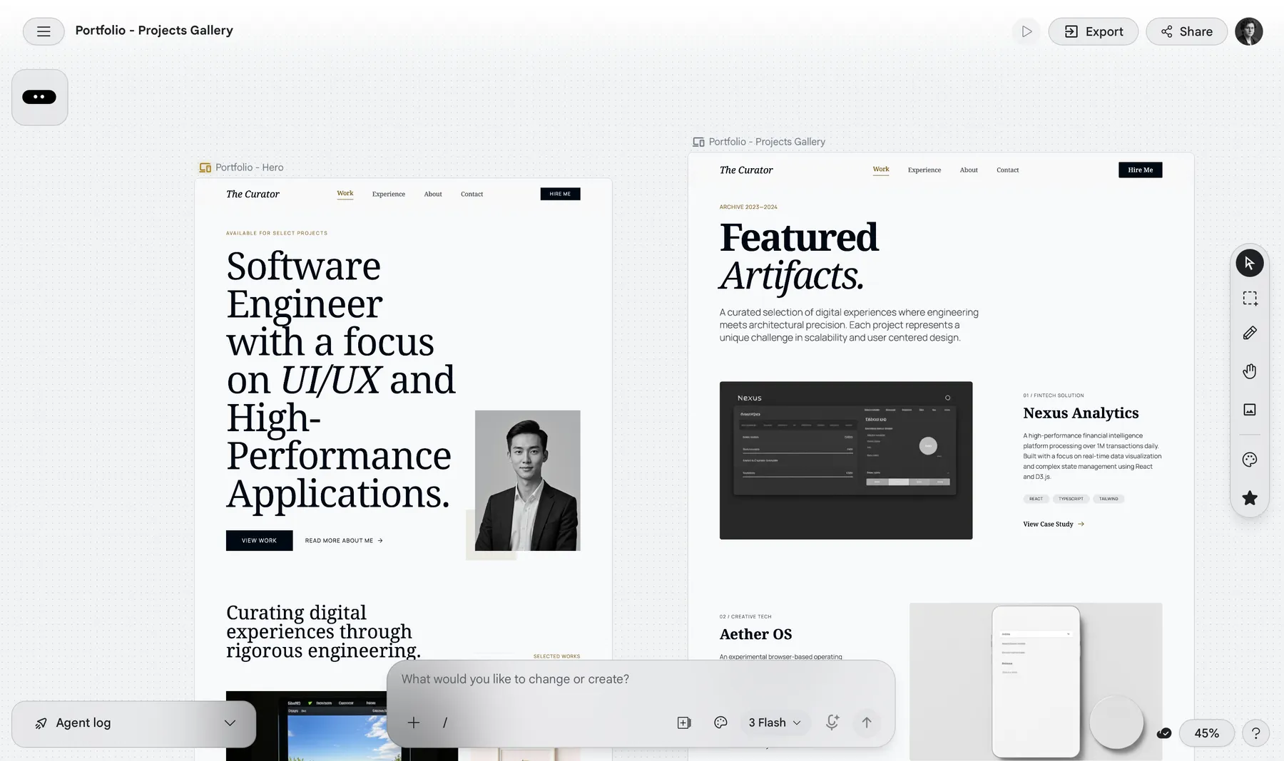
I wanted this redesign to keep what I liked about my previous portfolio: modern, fairly restrained, and not too playful. At the same time, I wanted to give it more character. The goal was something less minimalist and more editorial, with a quieter color palette, serif typography, asymmetrical layouts, and more visual material. I usually work in Figma, but for the first drafts I tried Google Stitch. It was surprisingly good at getting to a convincing direction quickly, though I still had to finish the details and make the design work as a real site. I used OpenAI Codex for the initial implementation.
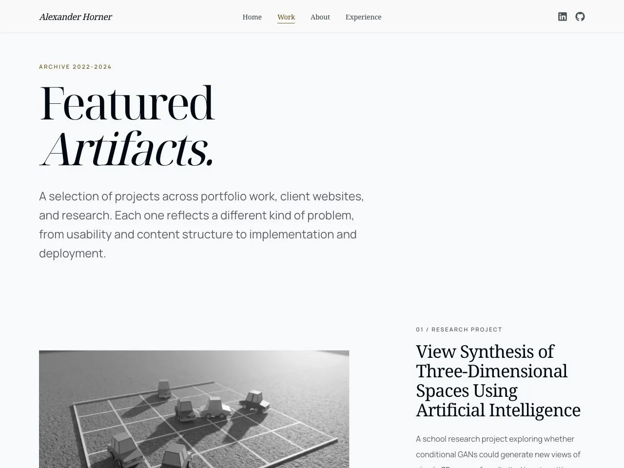
After about a year and a half of mostly working with Vue, I also wanted to use React again. I chose TanStack Start because I already liked TanStack Query and wanted something a bit lower-level than Next.js, with TanStack Router's type-safe approach. I used Tailwind CSS 4 for the styling and kept the case studies in Markdown so the content stays easy to edit.
Images were one of the more annoying technical parts. Since the content is static, I wanted to optimize them at build time instead of adding runtime overhead. vite-plugin-image-optimizer clashed with Nitro, while vite-imagetools did not fit the Markdown workflow particularly well. In the end I wrote a small Sharp script that creates the exact hero, gallery, and Open Graph images the site needs.
Later I extended the same visual direction to my resume. Stitch struggled with the A4 format, and the first LaTeX implementation through Codex was too uneven. What worked better was finalizing the design, giving Codex screenshots and specific areas to compare, and iterating until the result was close to the reference. That took longer, but it was a much better way to use AI for detailed visual work.