This Portfolio

- Technologies: Remix, MDX, Tailwind CSS, React Framer Motion
- Design: Professional, clean, modern, inspired by Polestar and Teenage Engineering
- Approach: Mobile-first design for better user experience
- Challenges: Routing, accessibility, animations
Technologies
This project uses Remix (built on React Router) for routing, MDX for content management, Tailwind CSS for styling, and React Framer Motion for animations. The pages are pre-rendered for better performance and SEO.
Design
For this version of my portfolio, I aimed for a professional, clean, and modern design with a touch of sophistication. Inspired by modern architecture and automotive design, the white and gray palette provides a clean look, while the orange adds a pop of color, drawing inspiration from Polestar and Teenage Engineering.
I designed and built this website mobile-first, which I believe ensures a good user experience on all devices. A mobile-first approach not only caters to the majority of users who are on mobile but also encourages better design by starting with the most constrained design space and progressively enhancing from there. In contrast, a desktop-first approach often struggles to adapt to smaller screens and reduced functionality.
With the animations, I aimed to achieve a more native feel for the website. While excessive animations can make a site feel cheap and unprofessional, subtle use can make it feel more alive and engaging, guiding the user’s attention naturally. Smooth transitions, such as content fading or sliding in, feel more natural than content appearing abruptly.
Challenges
I wanted to display other pages as cards overlaying the home page while maintaining proper routing, so the pages could be correctly linked and rendered on the server as they are displayed on the website. This also ensures accessibility for search engines and users with JavaScript disabled, enhancing interactivity before JavaScript loads.
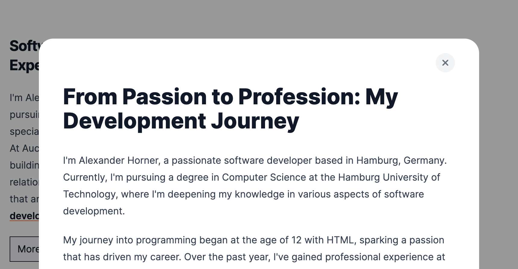
Another challenge was accessibility. When a modal is open, the rest of the page should be ignored by screen readers and keyboard navigation. While there are JS solutions for this, I wanted to ensure compatibility with routing and server-side rendering, even before JavaScript hydration. To achieve this, I used the browser's native dialog component. This was tricky because it needed to be opened imperatively on the client to enable the focus trap while being rendered on the server for accessibility. I pre-rendered it with the open attribute (rendering it but not as a modal) and then removed the attribute on the client, reopening it with JavaScript to activate the modal features.
Animating transitions was another challenge. The router typically removes the page when navigating away, but I wanted to animate the page out first. I solved this using a combination of useState, React keys, and cloneElement.
Images are optimized automatically at build time and loaded lazily to improve performance.

